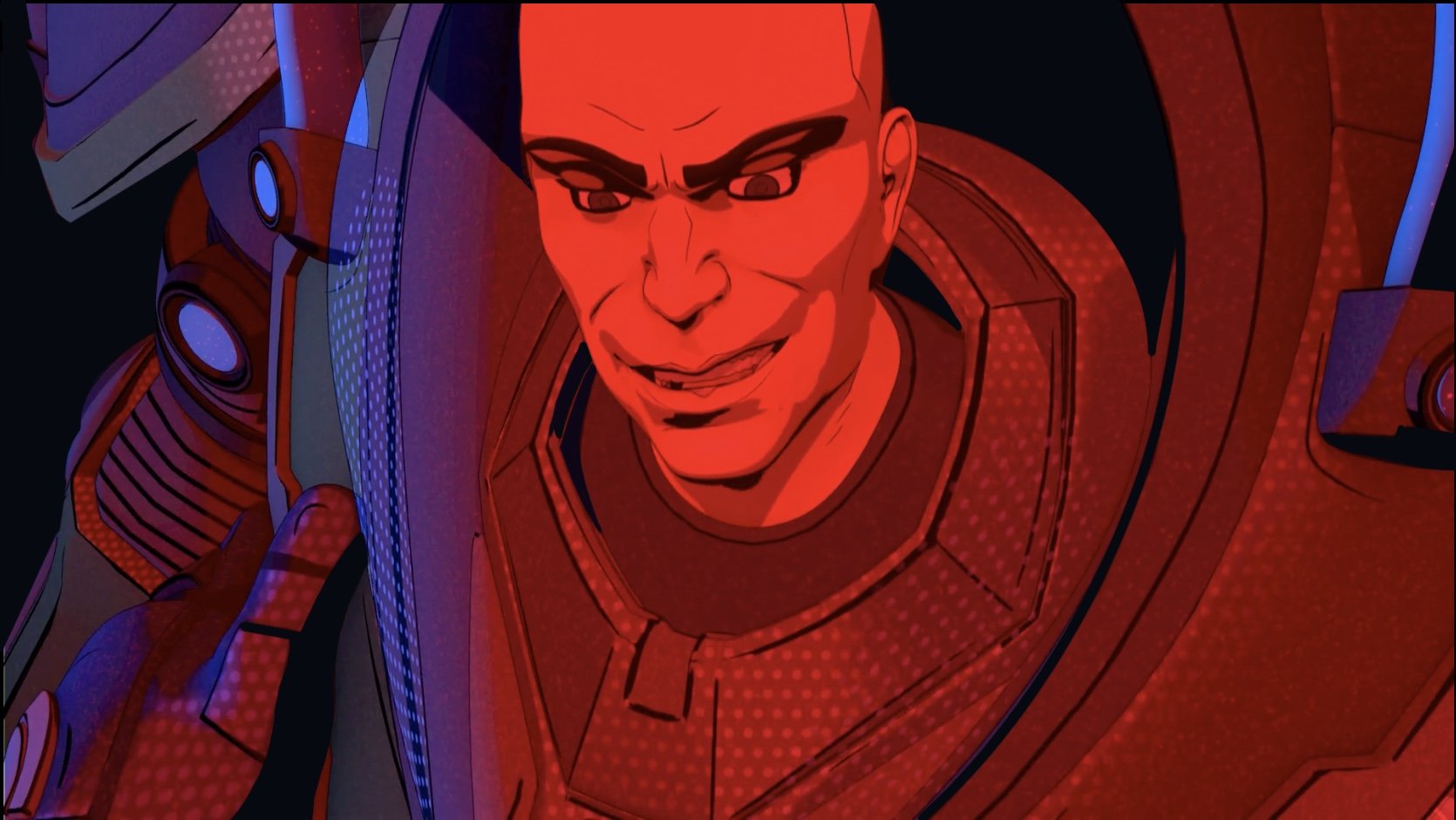
ART DIRECTOR
Client : Warner Brothers Discovery, Snowball VFX, 2023
Director: Chris Cherkas
My role: Art Director
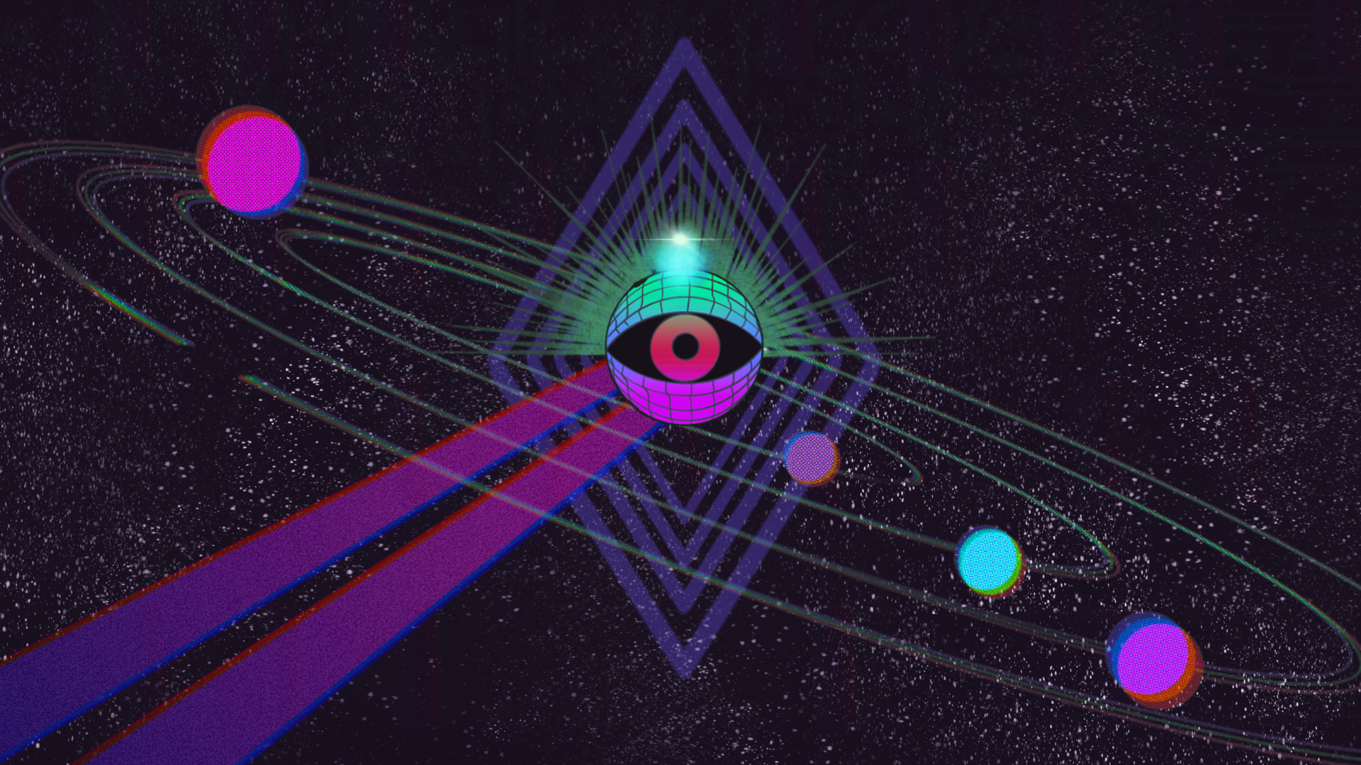
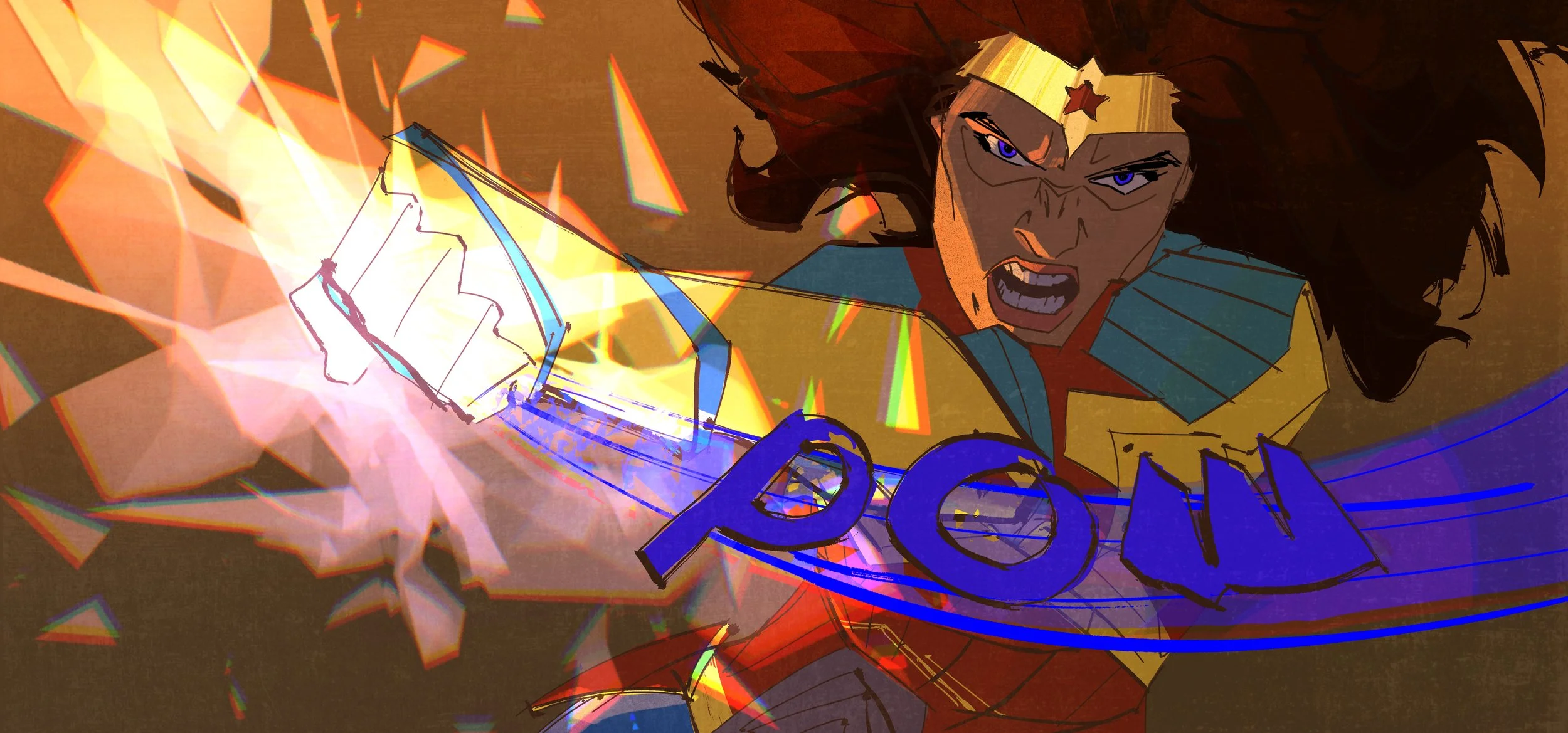
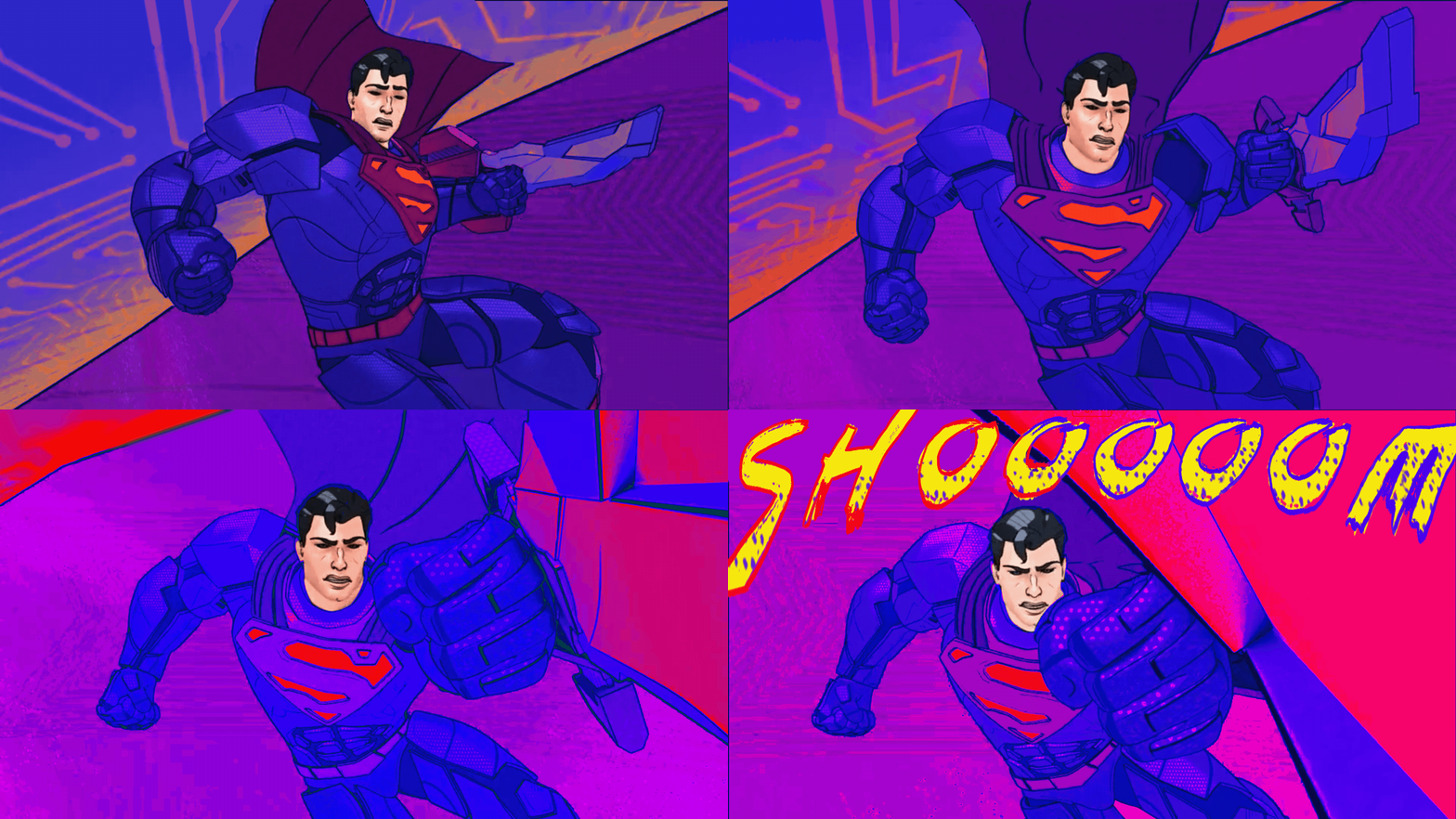
I worked closely with director Chris Cherkas and the Warner Brothers Executive Production team: Nick Jennings and Valerio Fabbretti, to envision the “DC: Metal Force” animated mini series. A special story written by WBDC and brought to life with a completely unique visual signature.
My mission was to create the style from the ground up and supervise all the teams together with the director Chris and EP Nick to create a dynamic and distinctive show, from early concepts and previs all the way through compositing and vfx.
From day one the project hit the ground running. Without time to test drive a pilot and with scripts still being written, I had to immediately work out the unique visual style of the overall series and then sub-ground each episode with clear, concise style guides. Visual references were corralled into delivery packets ranging from vintage comics to 80’s vaporwave to German expressionist theater, specifying exactly where and when these types of influences needed to present themselves in the show.
With the story still so fluid, I had to deliver a unique palette, shape language, concept art, set maps and designs, shot development, and sample VFX, packeted in a style guide format. With eight episodes and each taking place in a different world in the DC Universe, I started designing in the only way it made sense: each world was built from a specific shape or pattern.
style guides
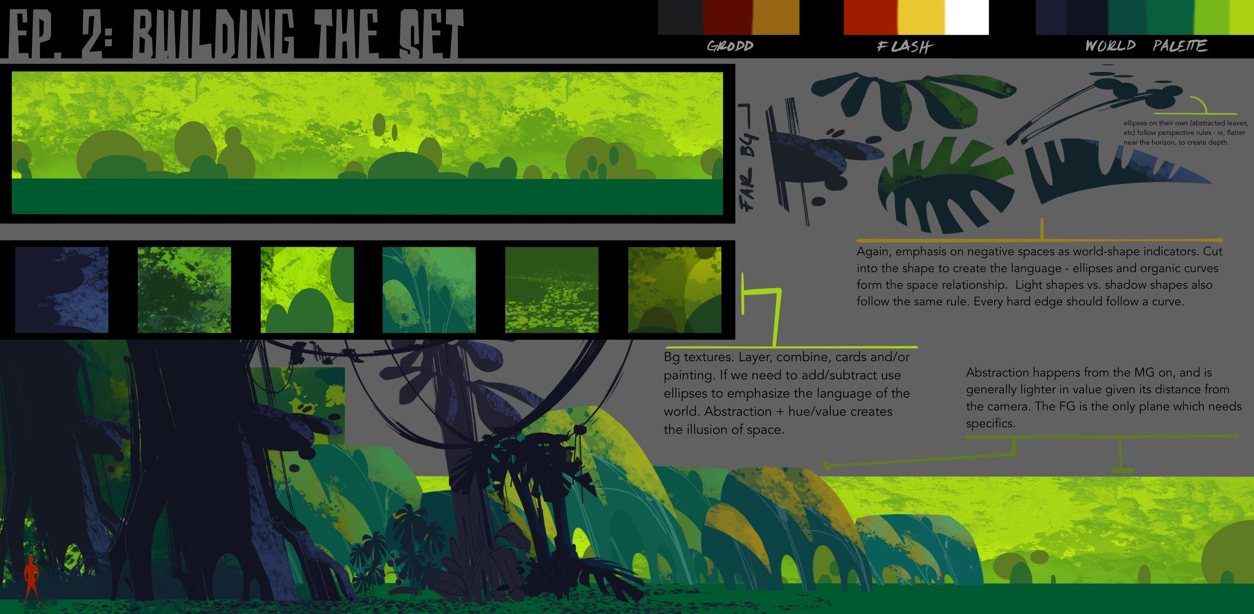
THE JUNGLE EPISODE
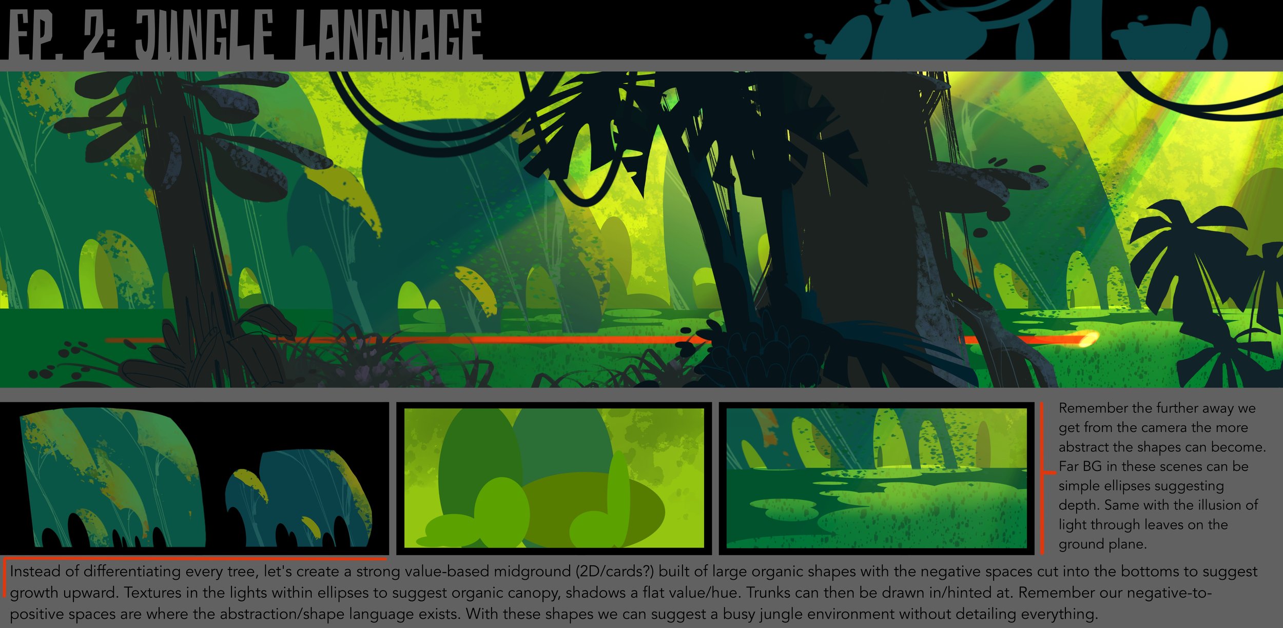
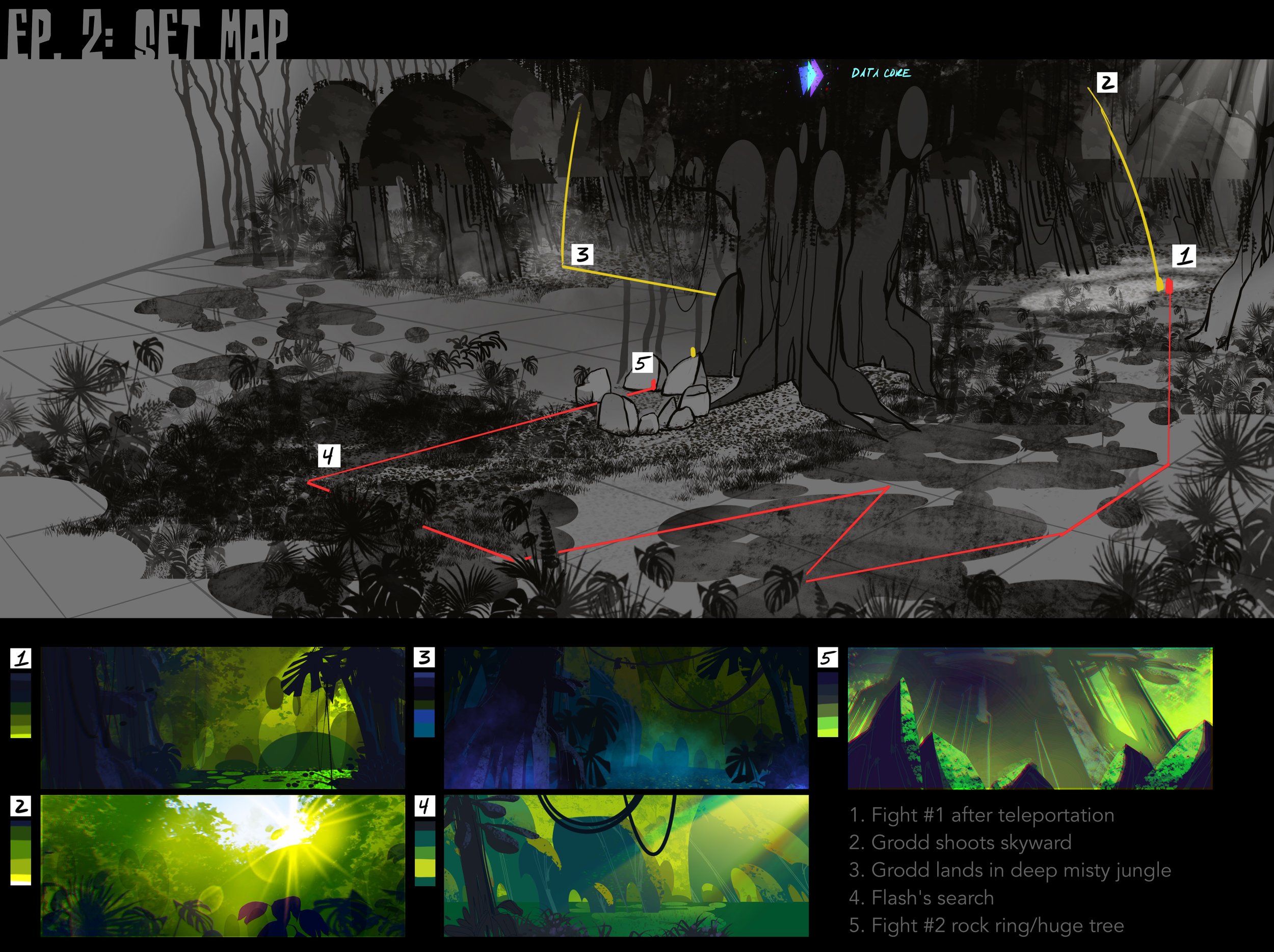
The Jungle Episode was built around ellipses and full, rotund textures. In modeling and texturing, we built successive perimeter cards painted with 2D artwork surrounding the set to give the illusion of depth and light. Tap arrows for more pages.
the asteroid
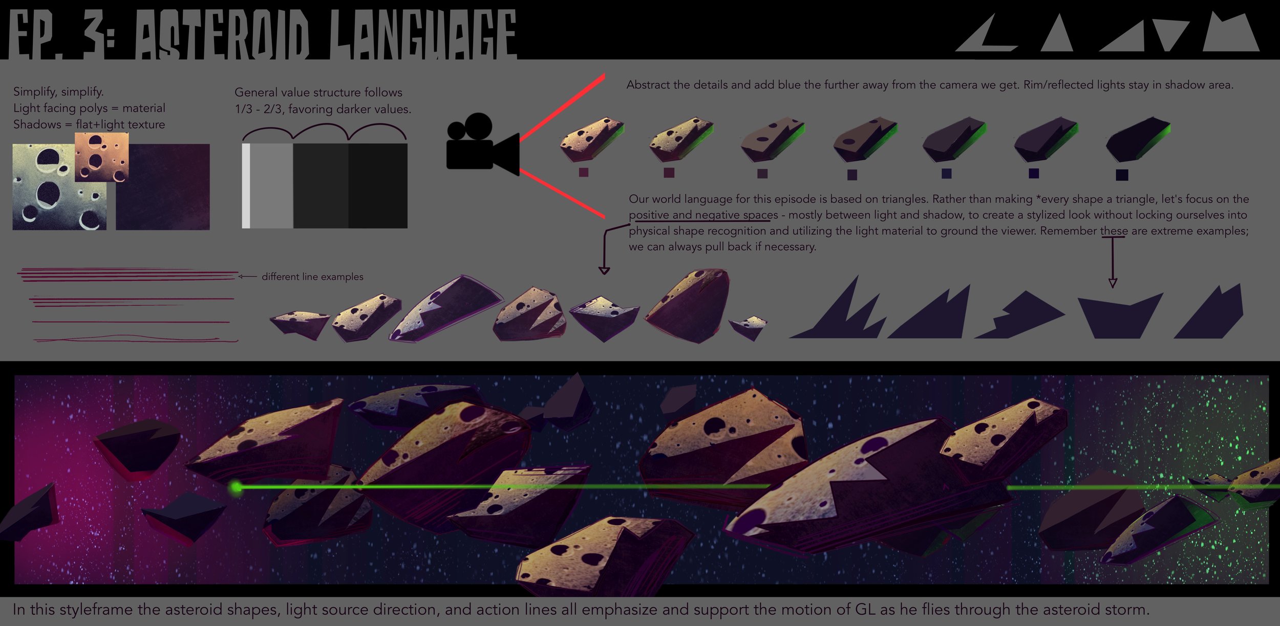
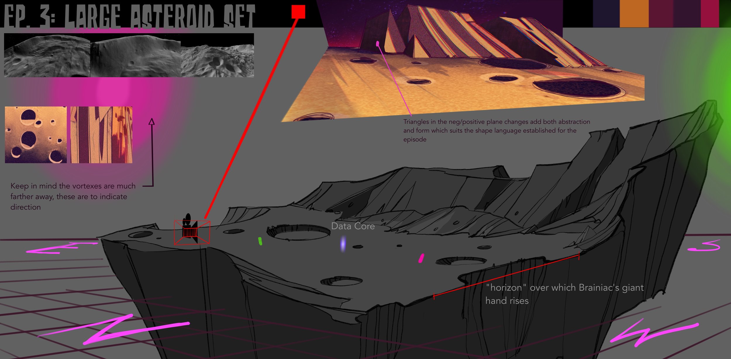
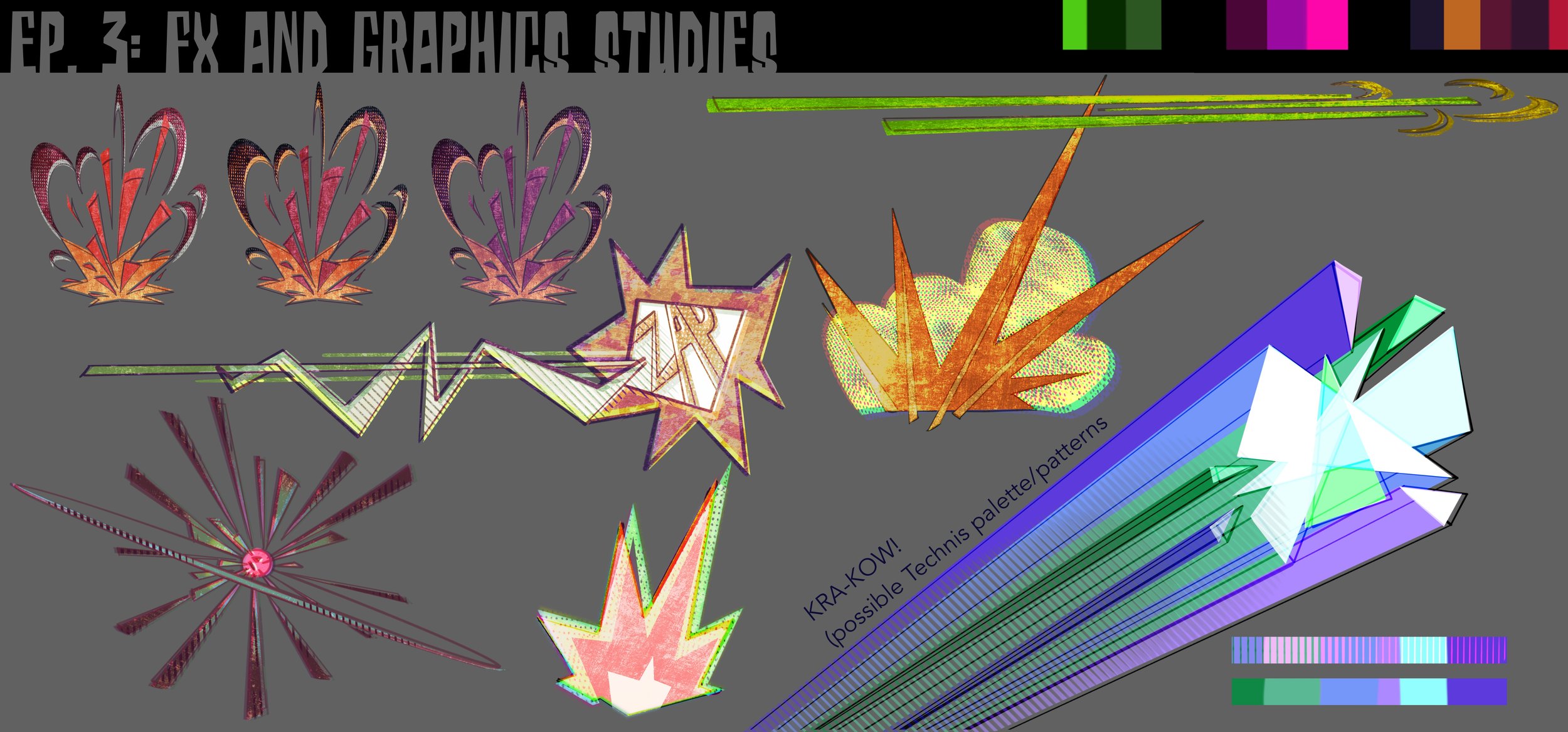
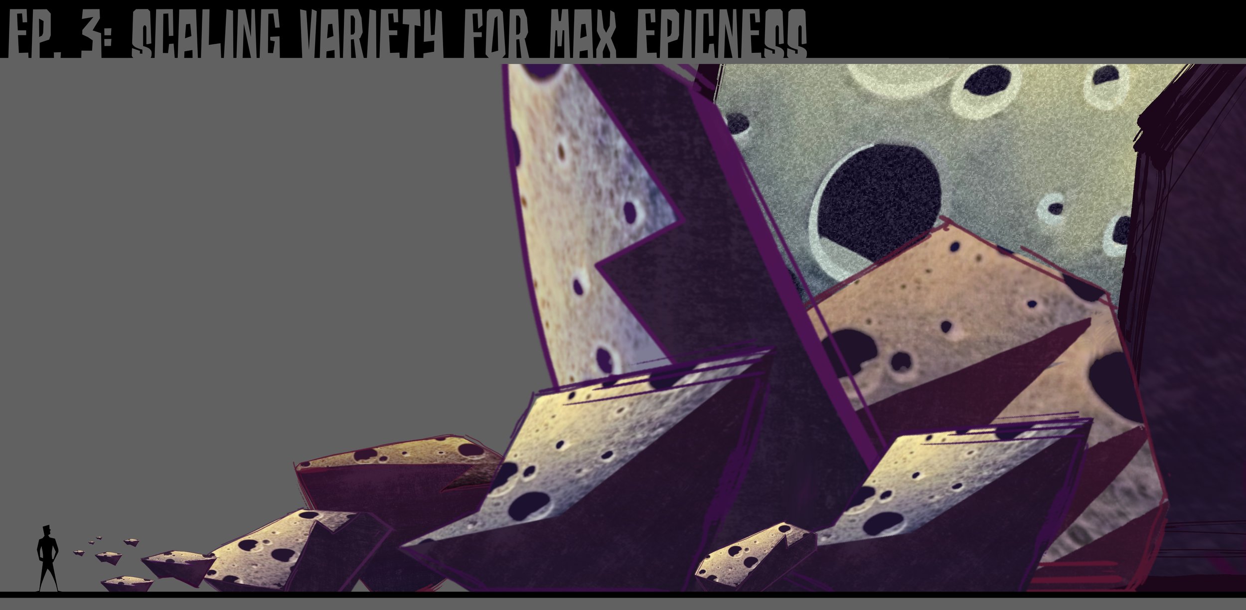
For the first episode to be finished in the timeline, I had to make very quick and simple design and camera decisions that would help us establish a solid foundation as we moved through subsequent episodes, so the design focused on triangular shapes; simple, concise, and readable. I wanted to make sure that a space battle was utterly clear, both for filming and palette, and that interacting palettes wouldn’t conflict with each other. Filming a villain in a black suit in space takes some big problem solving! Tap the arrows for more pages.
TECHNIS’ ARENA
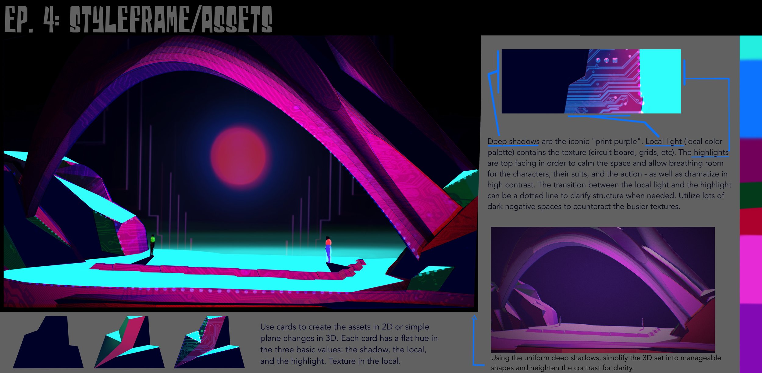
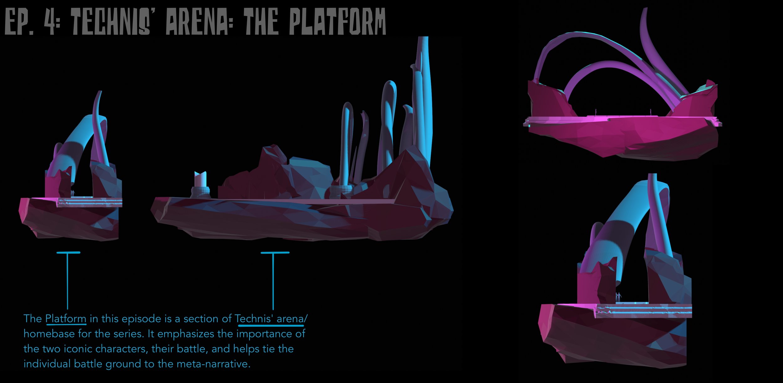
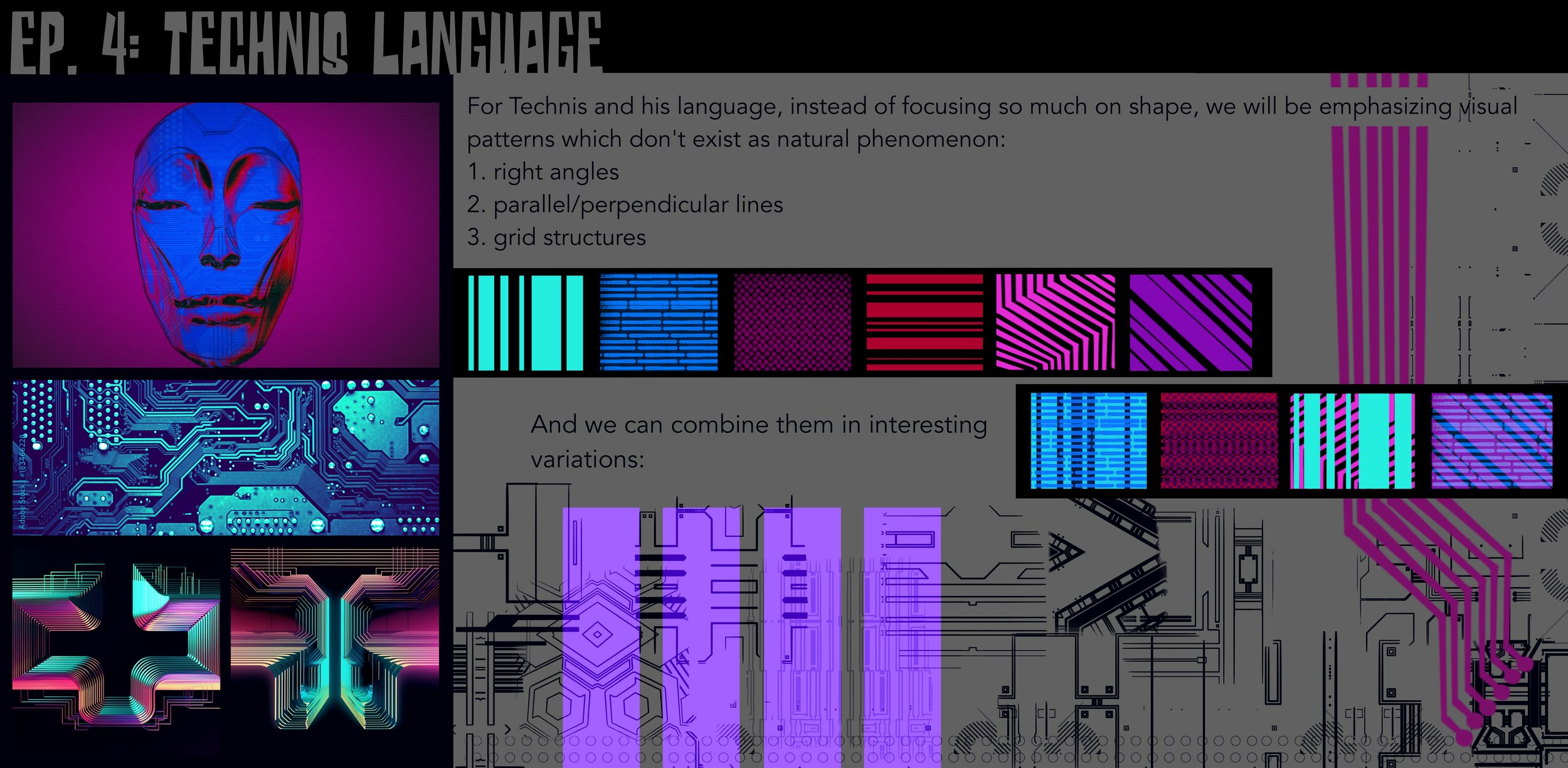
The Technis Arena was built not around shape but pattern. Aside from the regular tech patterns, we decided to pair those recognizable structural visuals with organic movement which both echoed old earth empire but was also designed to feel wholly alien. The “tech” patterns helped to ground the viewer which made such a unique and unusual set not only possible, but dynamic. Tap arrows for more pages.
Apokolips fire pits
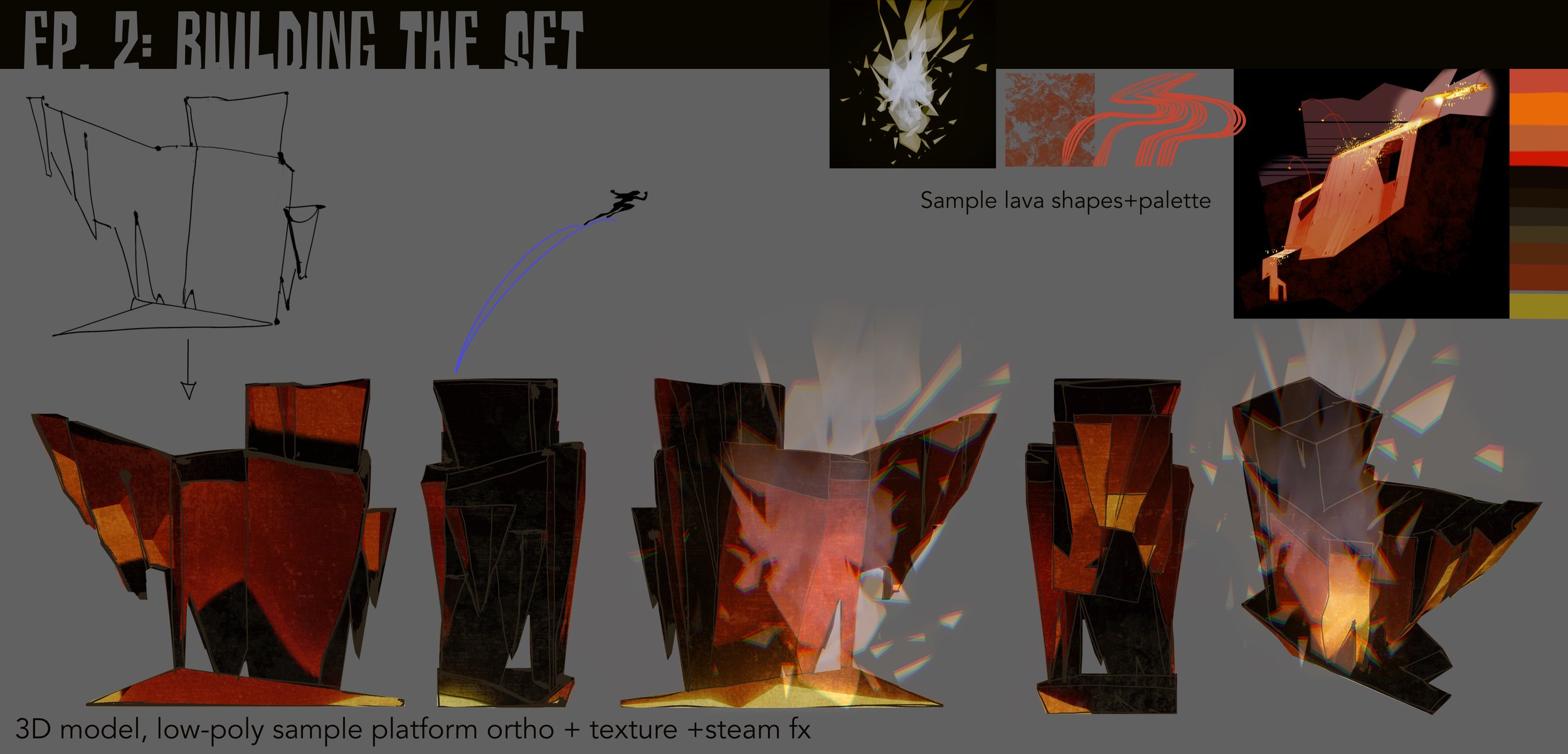
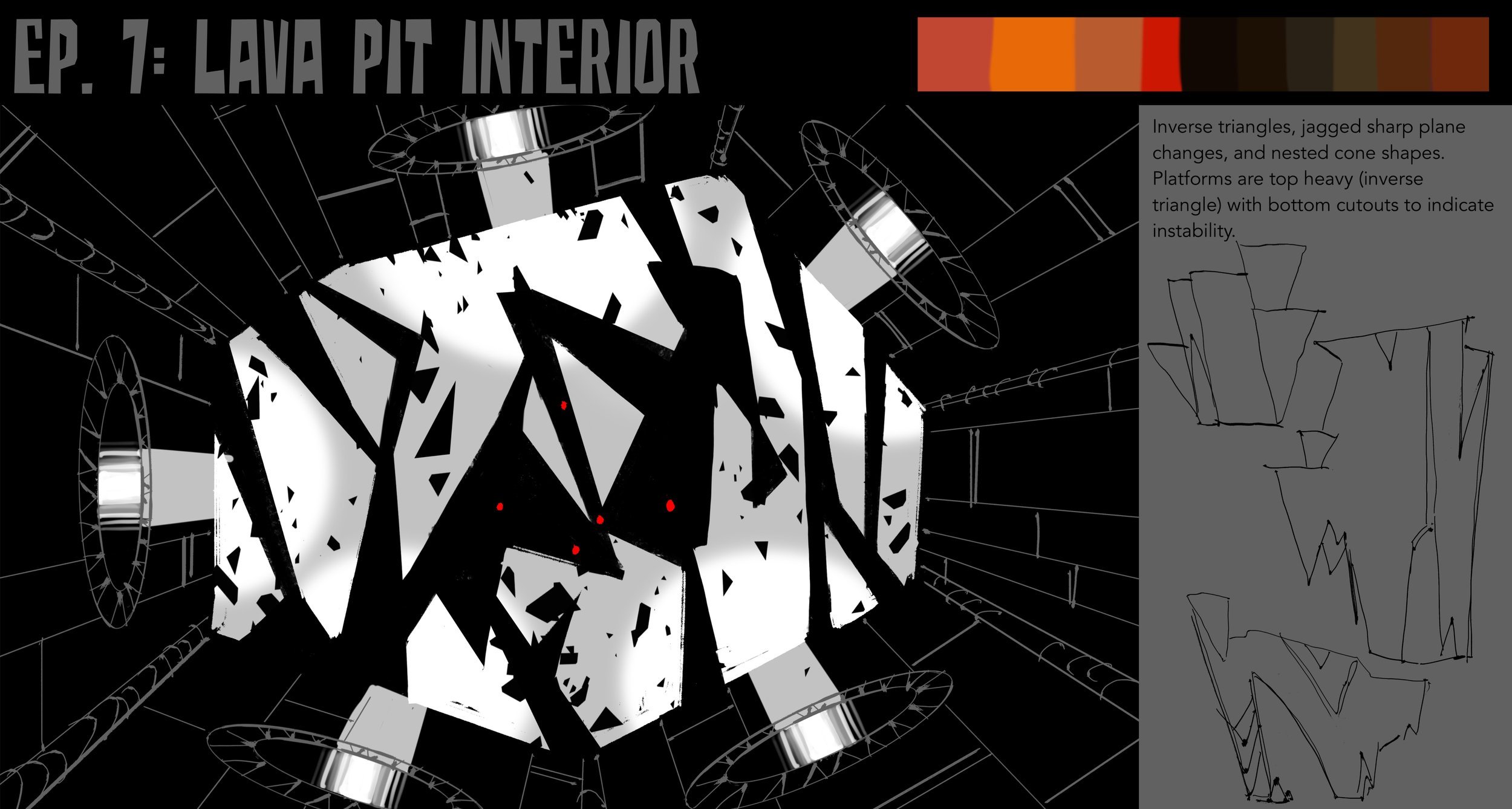
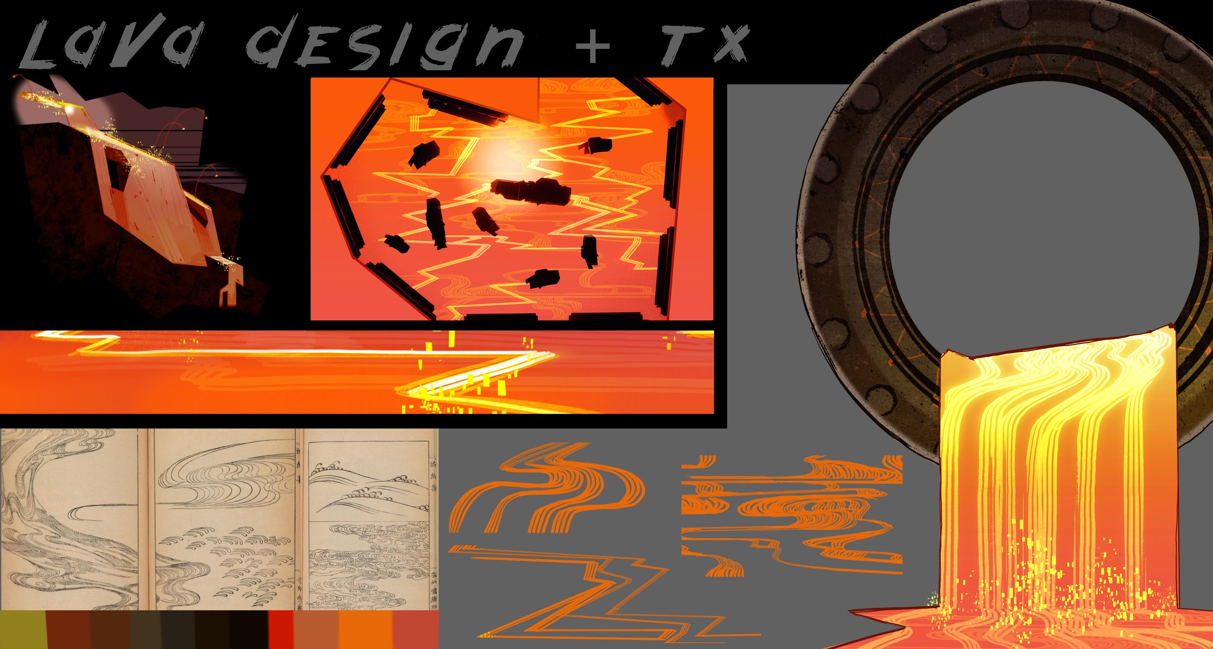
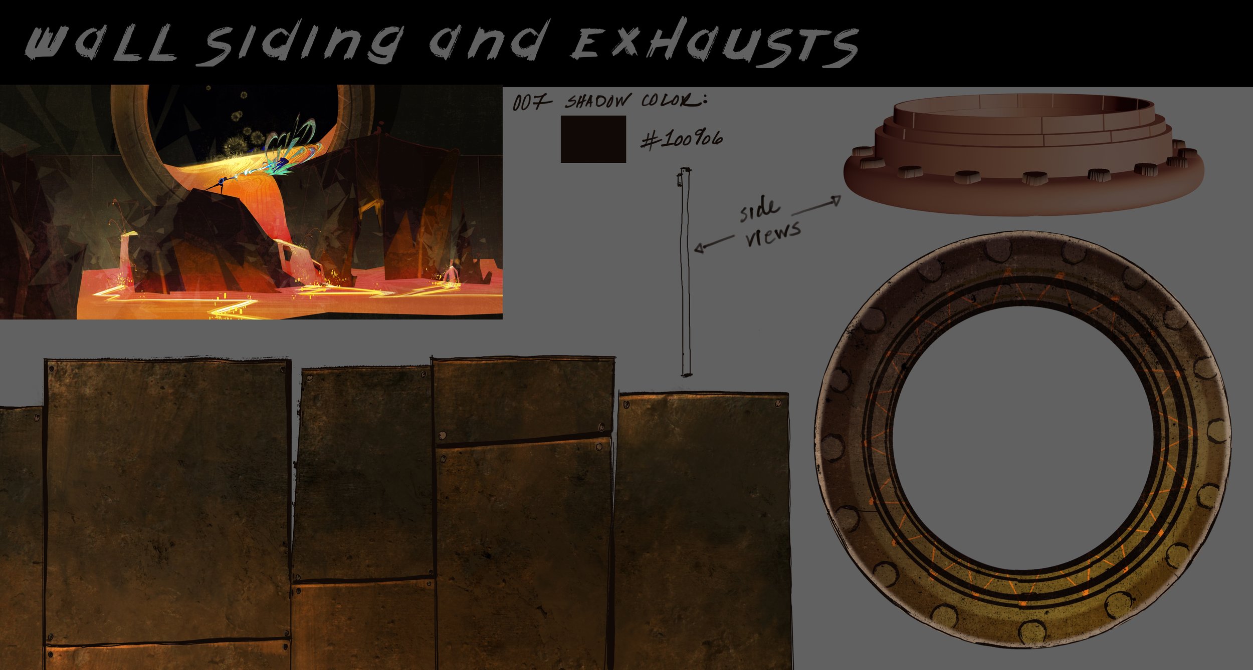
The Apokolips Fire Pits is a staple world in the DC Universe and as such, there was plenty of comic art to reference. However, in the spirit of doing things a little differently and within our visual style parameters, I designed the world based on oblique shapes and inverted triangles, as the setting for the episode was intended to be very dynamic and invoke the feeling of constant danger. Tap arrows for more pages.
the spider guild caves
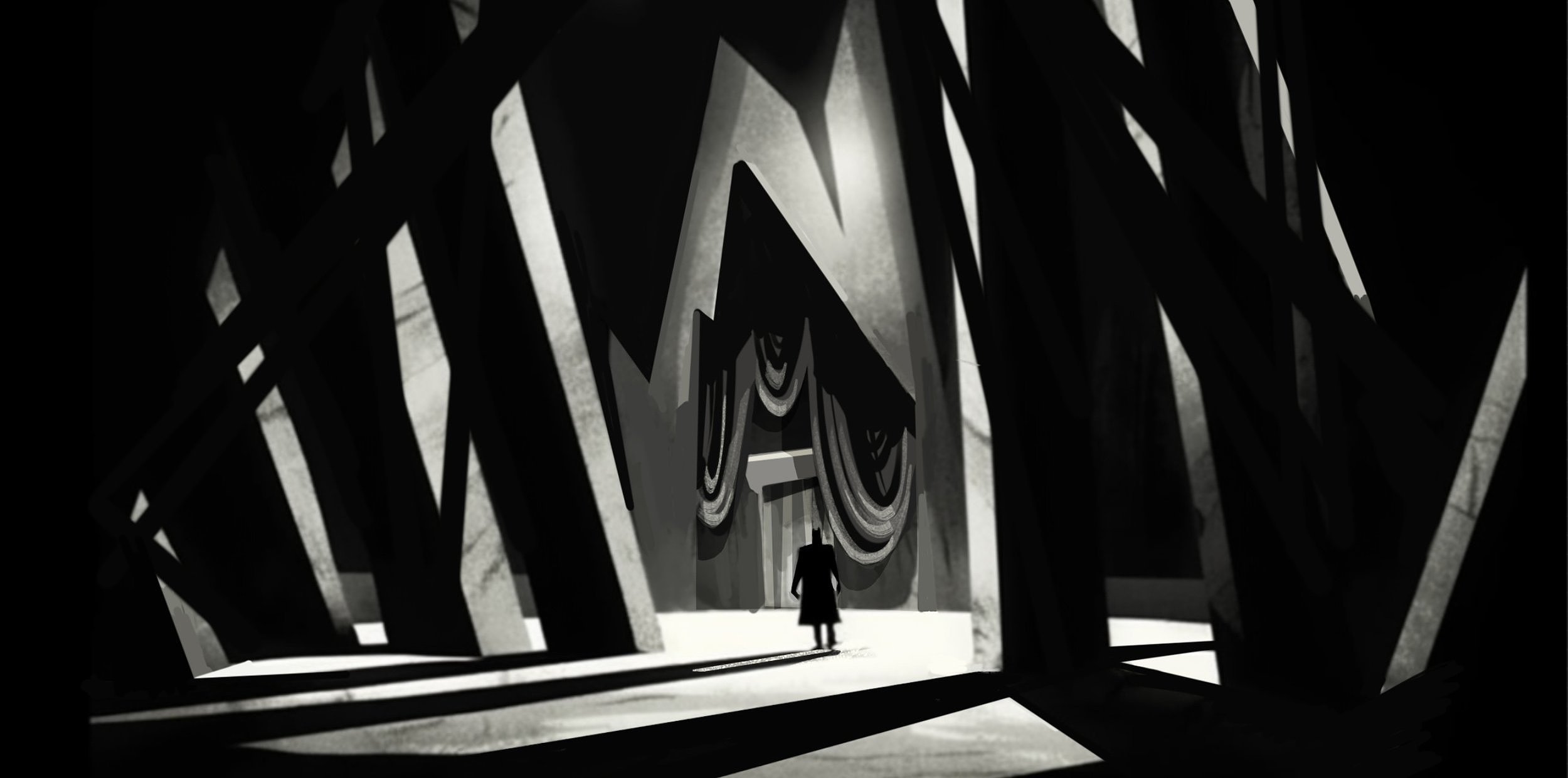
Episodes 5 and 6 were very, very different. So much so they required an entirely different approach to styling them. Taking place in a rough and dark cave system, what was needed most and quickly was a way to differentiate between “regular cave” and “Joker cave”, as these episodes were a two part face-off between Batman and Joker. So, instead of designing the episodes based on shapes, as previous guides, we decided to dive all-in on German expressionist shapes, light, and mystery for the regular lighting and then a “black light” effect for the Joker aspects of the caves while maintaining an overall concept of repetitive simple shapes and patterns to support the narrative of “multiple jokers”. The work I did was heavy on concept art, light design, and asset design.
SET DESIGN
DESIGNING THE SETS FOR THIS SHOW WAS SOME OF THE MOST CHALLENGING AND SATISFYING ENVIRONMENT WORK I HAVE EVER DONE.
TECHNIS ARENA
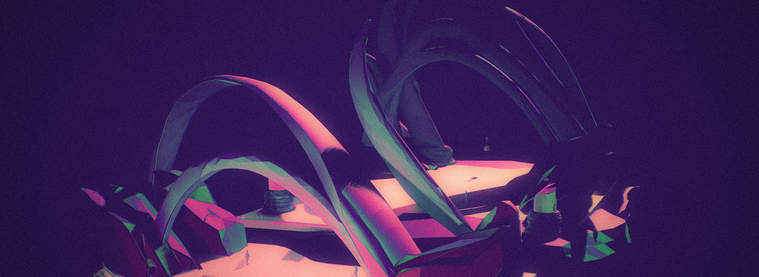
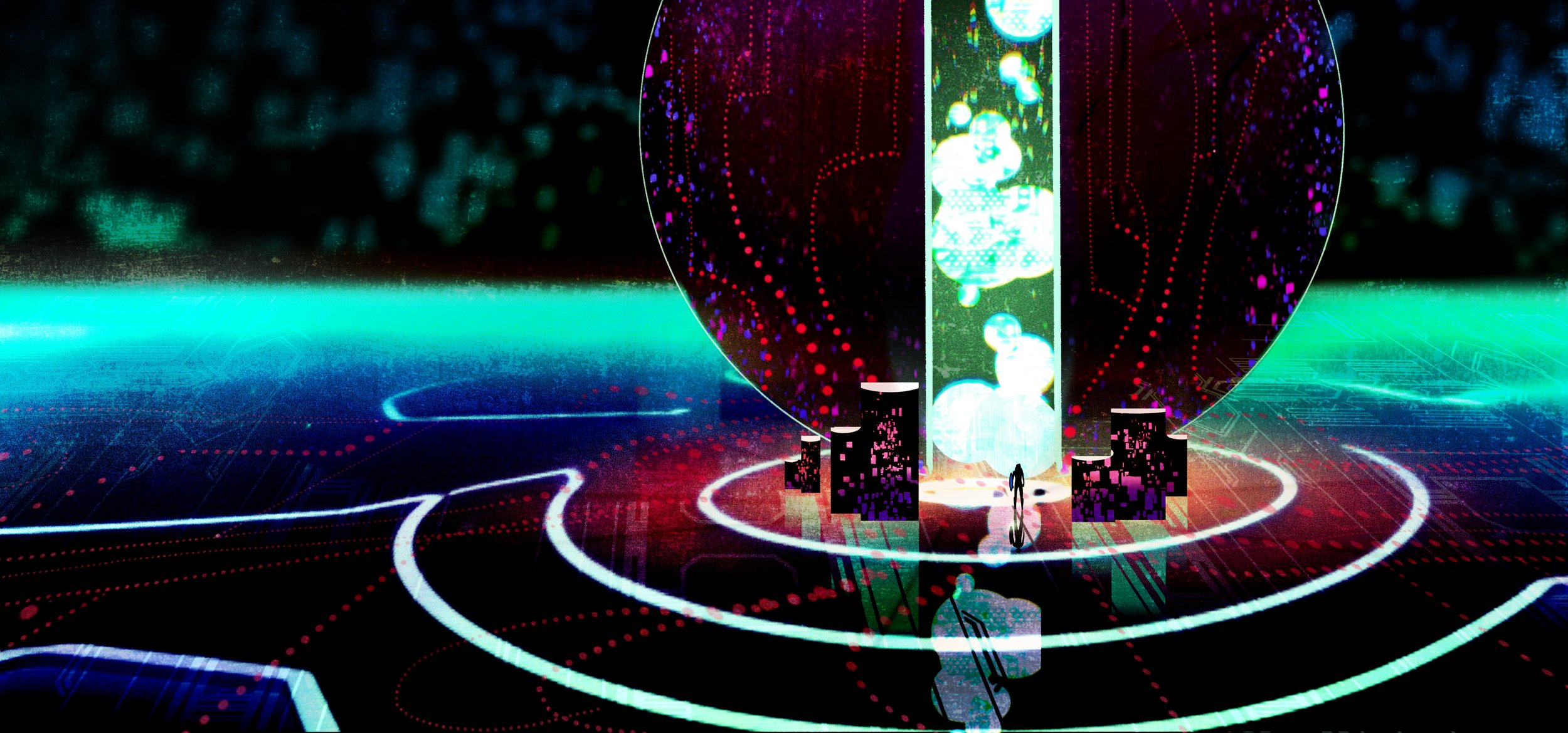
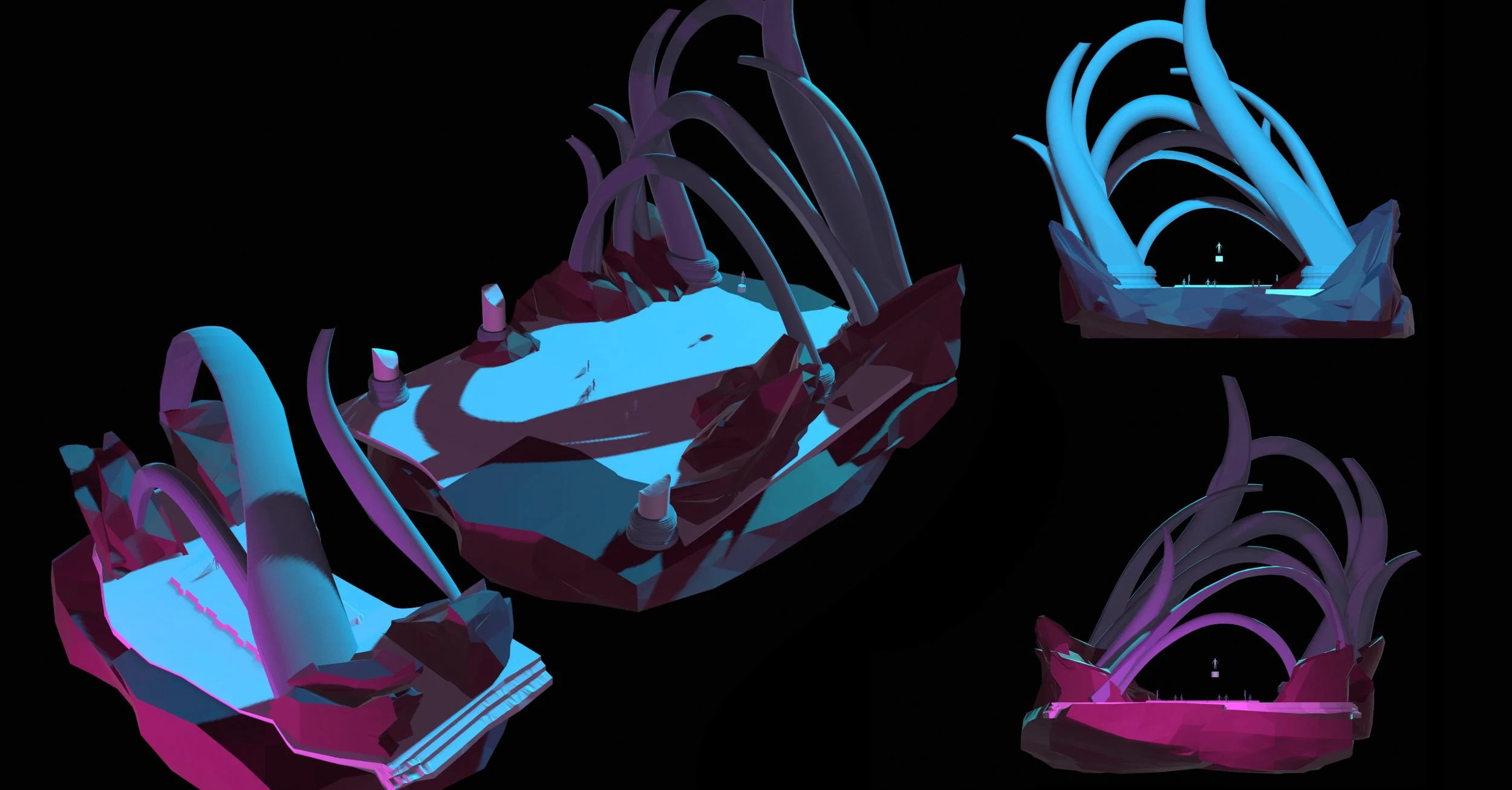
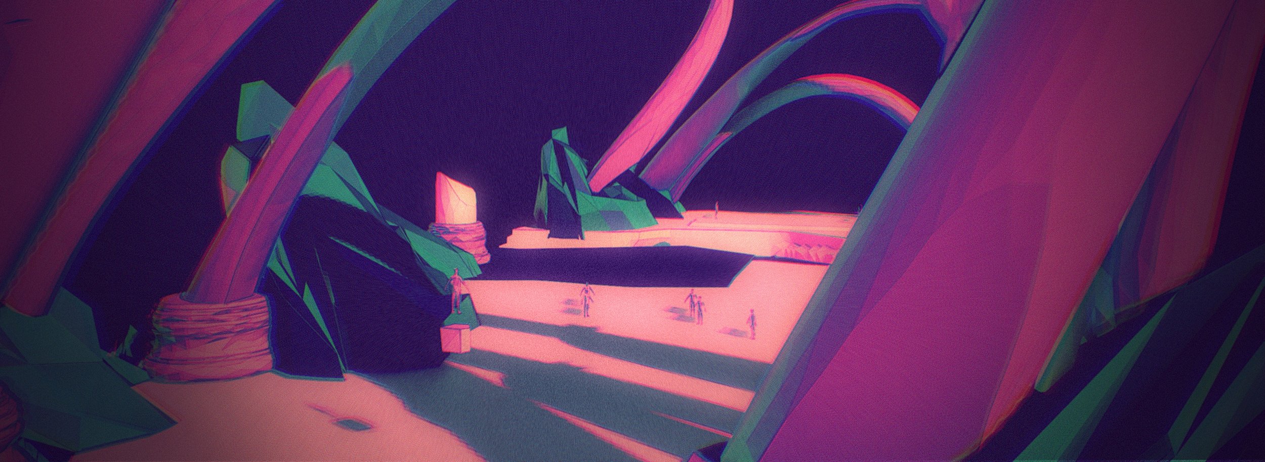
The Technis Arena set posed some very interesting and difficult conceptual problem solving. Nick Jennings, my EP, challenged me to combine old world grounding with alien shapes found in iconic science fiction painting by artists such as Dan McPharlin and Roger Dean. I didn’t have time to iterate in sketches so I simply dove right into 3D and played with shapes and movement until the set began to take shape. The language was built to be organic, light but reminiscent of “terrain”, and seem slightly impossible. I also had to keep in mind the action: this set floated in space, and the two main characters - Superman and Lex Luthor - were such iconic characters I wanted to keep the epic sense of scale but it also needed to be conducive to a lot of action in the air. The idea behind the opposing forms of swooping, light arcs grounded by heavy crystal-like forms was that the characters could disappear and reappear in and out of these shapes and dynamic shadow and light shapes formed by the set itself. I wanted it to be an extremely volatile and dynamic set that was very responsive to changes in lighting, as the set is meant to resemble liquid crystal states in physics in order to give it the ethereal quality you see in these images of the model below.
TECHNIS CORE
Thought not as complex as the Technis Arena, the Technis Core set was the beating heart of the Arena and the set for the final climax of the entire series. It is abstract, fluid, spatially vague, and not only had to accommodate an epic fight scene but a character that was human scale and another that was, quite literally, gigantic. With a final battle taking place between human scale and impossibly huge, the set had to have a lot of negative space but also not convey an identified “ground plane” so the camera could accommodate such extreme scale comparisons in a single shot without a ground plane interfering with the models or the shot composition. I had the idea to form this set tangentially to the Arena: with similar swooping arcs but more reminiscent of an old telephone switchboard. It felt techy but in a fabulously vintage way, and was still readable as a “center” or “core”. Here you can see the model and the 3D paint for surfacing and LRC reference.
LRC, VFX, AND ANIMATION
one of my biggest contributions to the show was unexpected: inventing and trailblazing through LRC, VFX, AND 2D ANIMATION TERRITORIES.
I had specific ideas on how to bring 2D comics into the series but wanted them to be fresh, gritty, and informed.
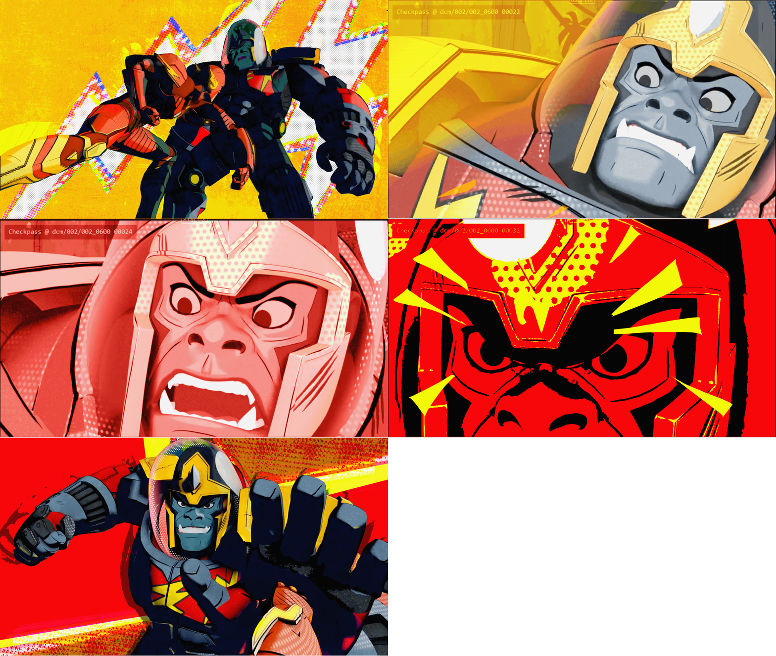
When our 3D shots were rendered through checkpass, I, my producer Sonya Carey, and the very talented comp team led by Mattan Ram and Ed Pasaoa took it upon ourselves to develop a brand new compositing technique, combining 2D and 3D in such a way as to bring the show into exciting and very unfamiliar visual territory.
