ART DIRECTOR

Client : Armada Content Studios, 2022
Director: Joel Gibbs
My role: Art Director: Concept Artist/Set Designer/Color Designer/BG Layout and Paint Supervisor
I worked closely with director Joel Gibbs to develop the unique look for this film. A true 2D/3D hybrid, we wanted a watercolor feel with gentle palettes and natural lighting to give this turn of the 19th century story a vintage, nostalgic feel.
My mission was to help develop the style, create concept art, design and model 3D sets for reference, design the color and light, and supervise the 2D background layout and painting.
capturing history
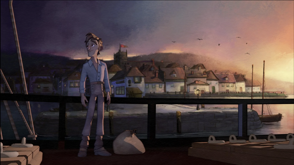
The film takes place in historical Falmouth: a small port town in Cornwall, England. Being quite the nerd for historical research, I developed a substantial visual foundation on which to build our “real place but not really” locations. The look and feel of this film is reminiscent of old landscape paintings, the crisp and vividness of a town without major industry, and the sketches of a traveler’s book.
I was first tasked with concept art to capture different atmospheres of the town and surrounding ocean in various lighting scenarios. The timeline for this project was very short and so the art had to land the feel of the film - style refinement came later.


SET DESIGN
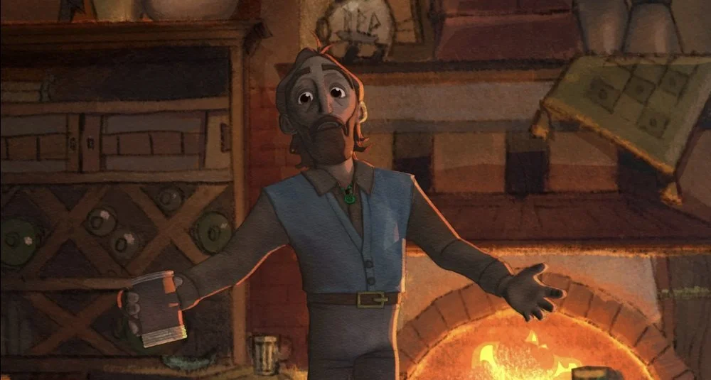
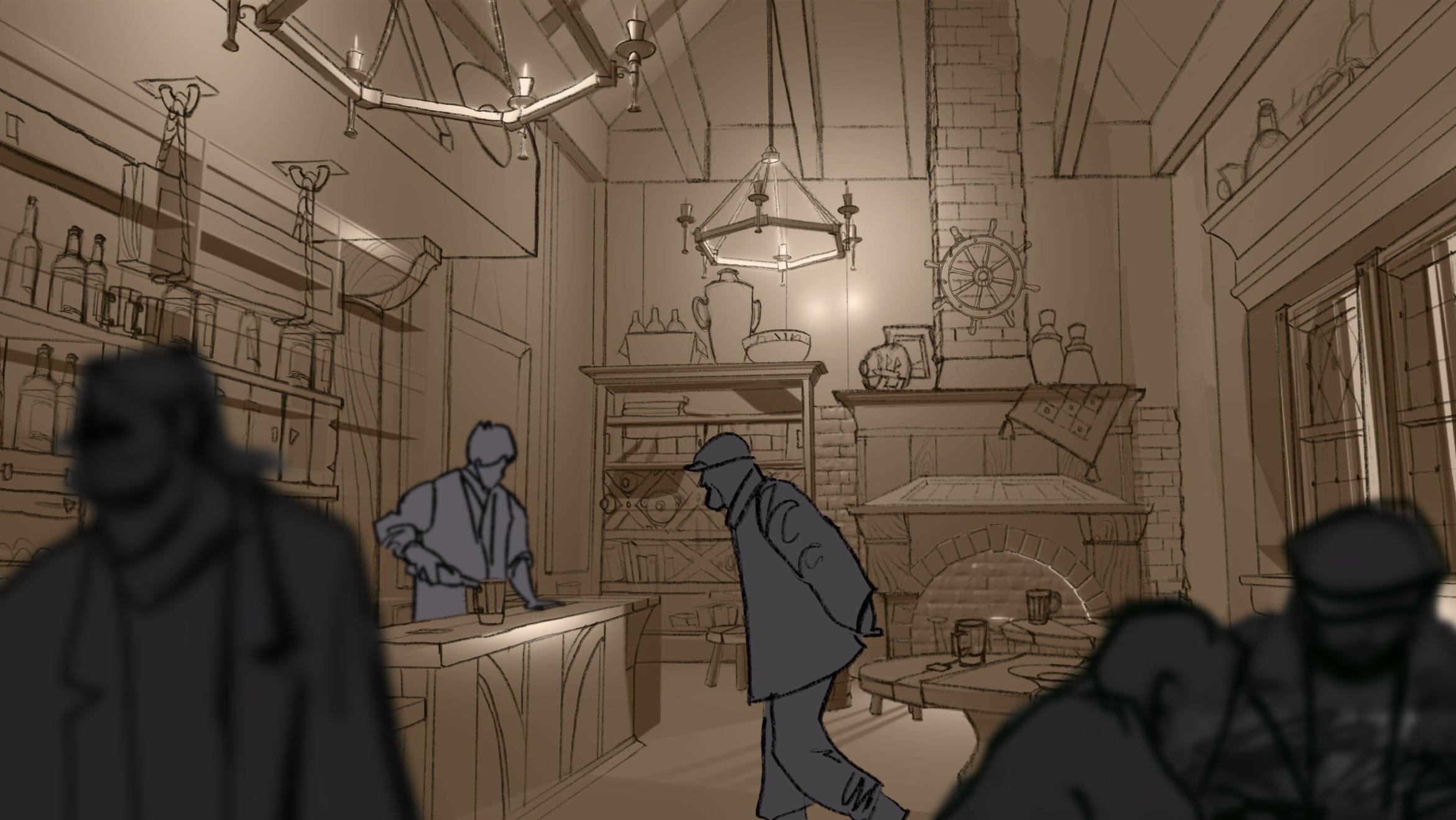
THE HARBOR TAVERN AND TOWN OF FALMOUTH
The harbor town was historically built of waddle and daub but over the years an iconic, white-washed surfacing began to cover it. The limestone in the wash better protected the buildings from the wear and tear from the sea and is now the current historically accurate upkeep of the area. At first I sketched out the more Tudor-style waddle and daub but we ended up adopting the limestone wash for its cultural significance, even though it is technically after the period of the film. I modeled the interior and exterior of the tavern roughly in 3D for my own reference as well as the storyboard artist, and even though the final film’s backgrounds were to be painted in 2D, the models provided us with a consistent means of layout later in production.


WE ENDED UP HAVING ONLY ONE SHOT OF THE TAVERN EXTERIOR, SO MORE ATTENTION WAS PAID TO THE INTERIOR PALETTE AND LIGHTING.

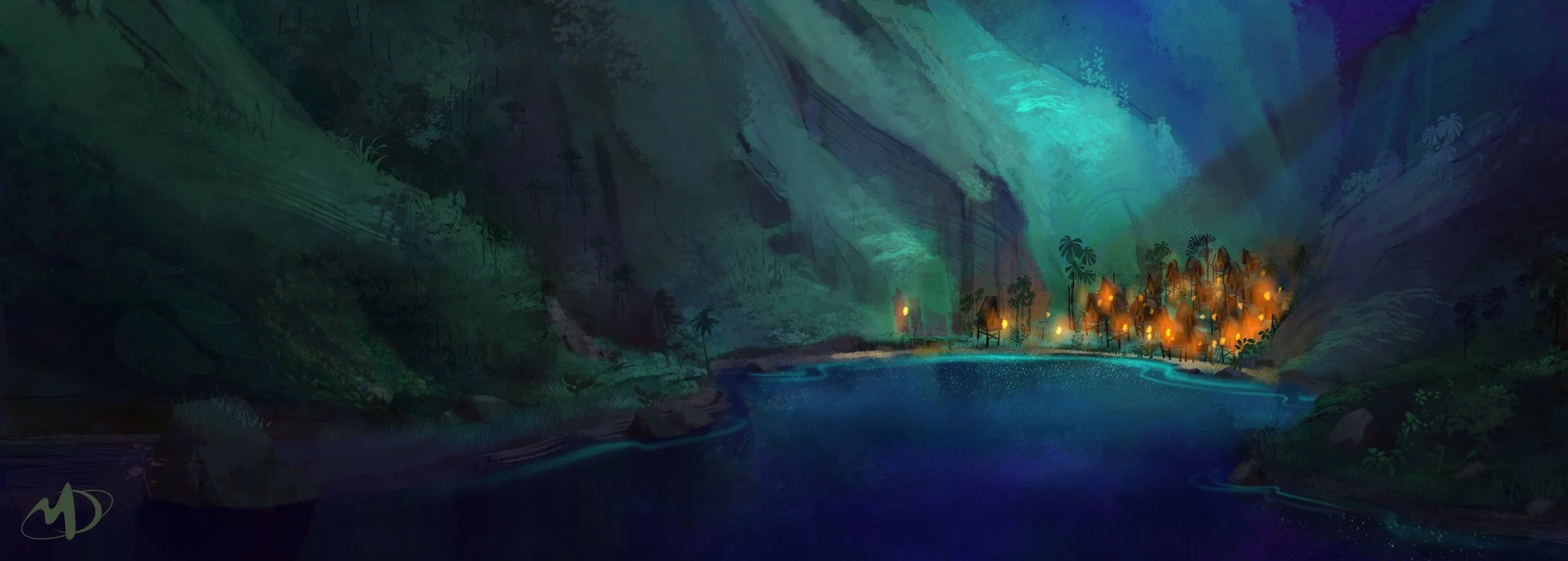
The Polynesian island
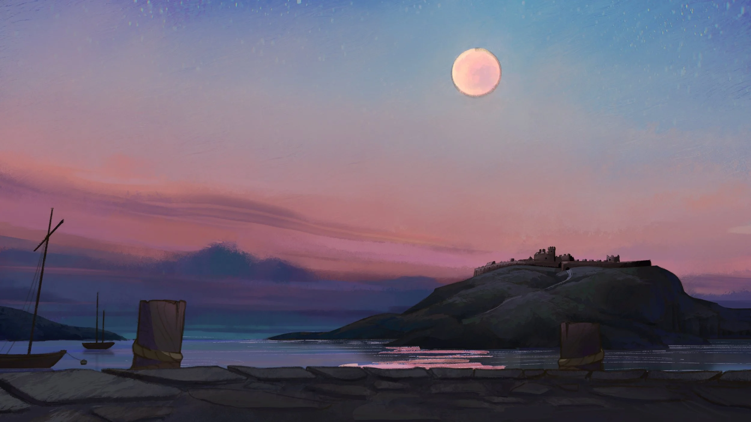
The Polynesian Island set was far simpler as the only shots involved were a long shot with a light push-in as the ship approached the cove, and the very tip of a peninsula looking southward to open ocean. While not very involved in itself in terms of design, the shots were set up in such a way and the camera was moving so specifically to accommodate the 2D nature of the backgrounds that I had to create an island shape with very distinct cardinal direction pointers and specify camera angles wherever possible - I created more of a set map and shot direction and a few assets, more so than deep set design, then moved onto background supervision for the shots.

THE APPEAL OF THE ISLAND WAS LARGELY IN ITS SCOPE AND OPENNESS, SO THE SHOTS WERE DESIGNED TO TAKE ADVANTAGE OF THE NATURAL AND SPACIOUS FEEL OF IT COMPARED TO THE TOWN OF FALMOUTH.


COLOR DESIGN
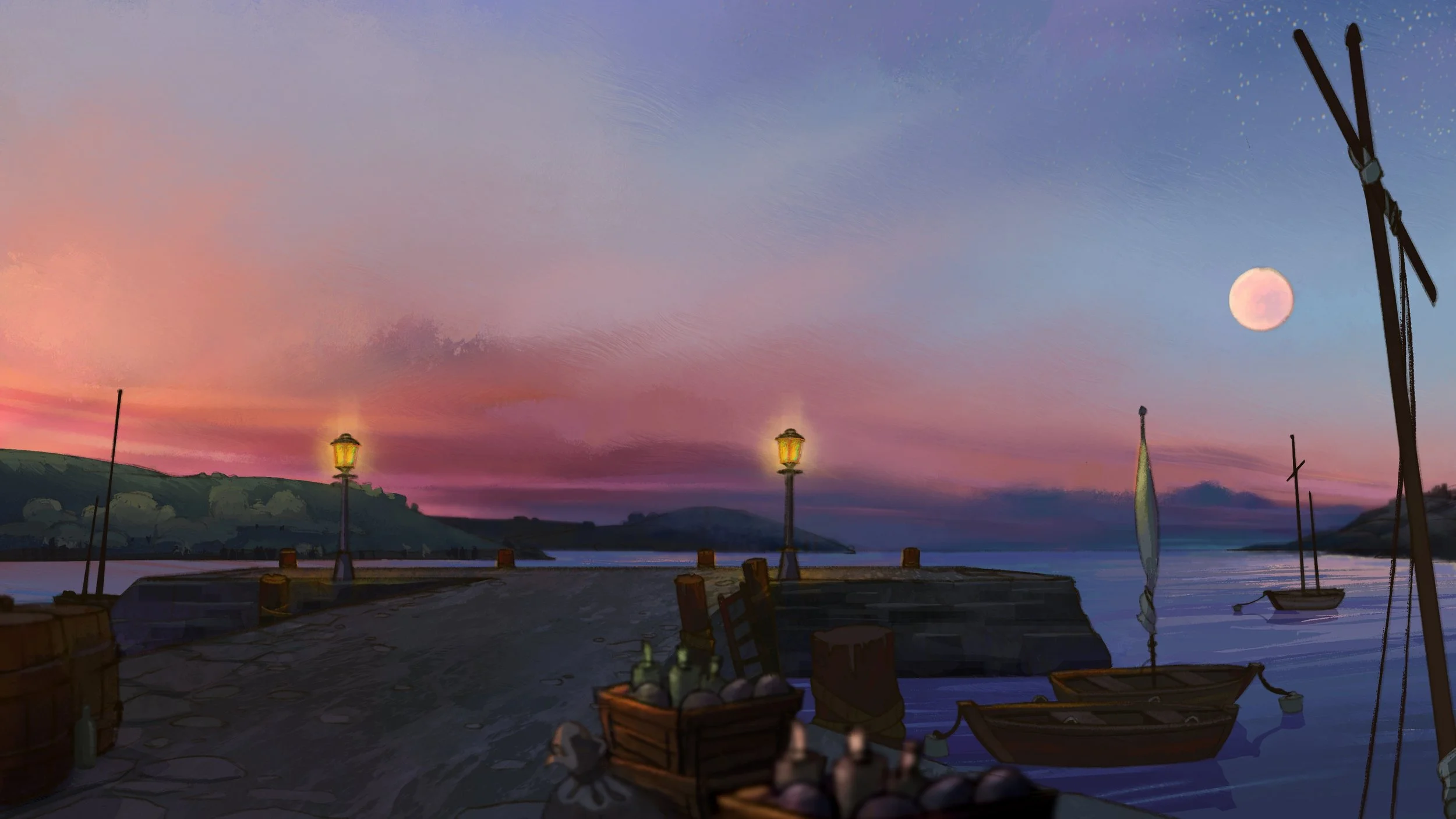
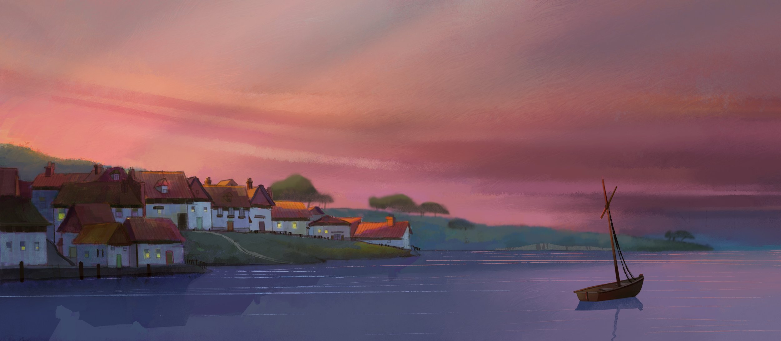
The color design for the film was built around the two opposing environments: the town of Falmouth and the Polynesian Island. The idea was pretty simple; a warm and desaturated palette for the harbor and tavern, and then throughout the film as we move to open ocean and the Island, the color becomes deeper, vibrant, and colder. As the era in the film was pre-industrial, natural man-made light played an important role in threading the story together: the candlelight in the tavern and the torch light at the island helped connect the two main environments in the story (aside from the more obvious presence of the moon throughout the entire film) and allowed us to transition quickly between the two in final editing when necessary.
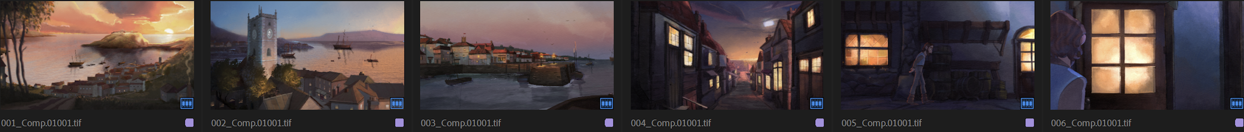
Due to the short timeline I couldn’t paint a full color script, so I provided color bars beneath the storyboards in key scenes and transition scenes so that the BG team would have clear palette references when painting and could envision the major color changes throughout the film as a whole.
INTRODUCTION: COLOR BARS AND BOARDS

INTRODUCTION: FINAL COMPS
CERTAIN ANCHOR SHOTS HAD TO BE EXPLORED MORE THOROUGHLY, SUCH AS THIS SHOT OF THE ISLAND. THIS SHOT WAS A NARRATIVE LINCHPIN AND HAD TO BE CAREFULLY DESIGNED.
FINAL COMP BOARD FOR OVERALL COLOR DESIGN
BG LAYOUT AND PAINTING
The director and I identified the number of unique BG’s, the number of reuses, and how many artists we would need to assist me in painting. I was fastest in the layout stages more so than the rest of the team, so that became my biggest priority when developing BG comps for the shots. Since some of the characters were in 3D, the animators had no idea of scale of action within a shot in most cases. So in addition to creating the layouts for the unique BG’s, I would draw character proxies into my layout frames to assist the animators with action, composition, and scale. I painted select anchor backgrounds and then guided my team into painting the rest, working with paintovers and palettes to attain consistency.